A short-form video's retention chart looked like a regression. Average view percentage had dropped week over week, and the obvious read was: the content got worse. Neither turned out to be true.
The setup
Retention on short-form platforms is usually shown as percentage of the video watched — average view duration divided by video length. It's the default because it's easy to compare at a glance. It's also quietly broken the moment you compare videos of different lengths.
Where it broke
Two videos, two different retention percentages, read as one performing worse than the other. But the videos weren't the same length — a 35-second video and a 50-second video produce different percentage-retention numbers for the exact same viewer behavior, purely because the denominator changed.
The fix
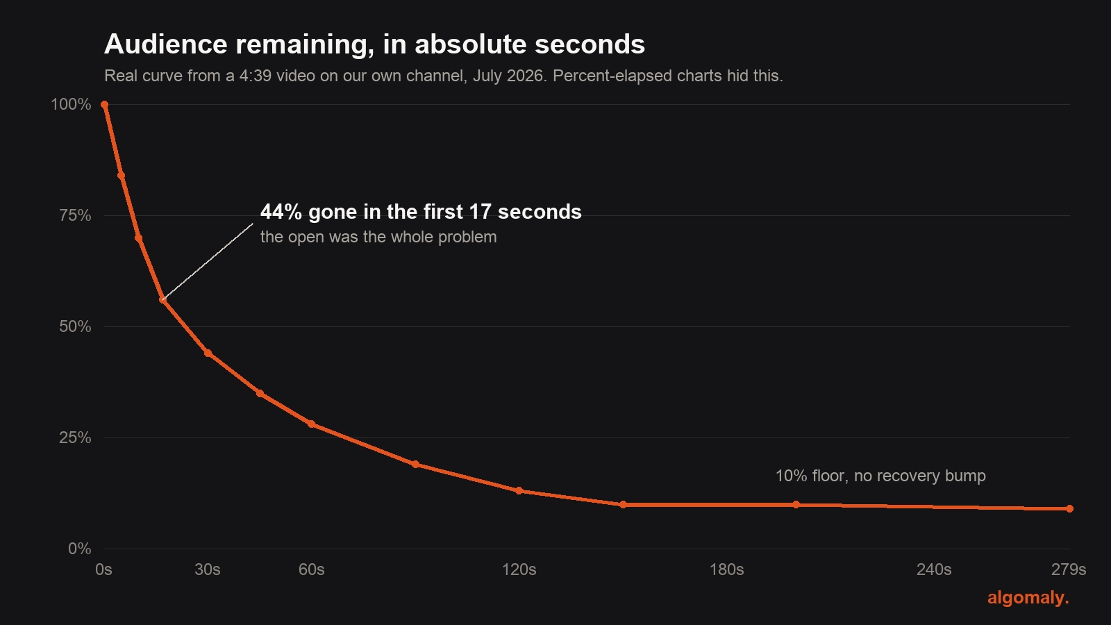
Re-run the same watch-time data in absolute seconds instead of percentage-of-duration. That number is comparable across videos regardless of length, because it isn't relative to anything that changes between them.
What that actually revealed
Once the duration artifact was removed, the real pattern was obvious: a consistent drop-off in the first 5–10 seconds, present in every video regardless of length or topic. Not a content-quality regression, not a length problem — a hook problem, the same one, repeating.
The reusable idea
Any metric that's a ratio hides the two numbers that produced it. Before trusting a ratio to diagnose a problem, ask what happens to it if only the denominator changes and nothing else does. If the ratio moves without the underlying behavior changing, you're not measuring what you think you're measuring.
Systems like this one, built for your business.
We build production AI systems for service businesses — and write up how they actually work.
Book a free strategy call →